

What language should you use in IELTS Writing Task 1
Hello IELTS warriors!
We hope your IELTS learning journey is going well! :)
Many of our students in IELTS Course are confused about how to tackle IELTS Writing Task 1.
Indeed, to many of our students, and we are sure this is true to other test-takers out there as well, synthesizing graphic information to a report is completely new territory.
But don’t be afraid! It’s not as hard as you think!
And of course, we are here to help! :)
So, in this article, we are going to talk about the appropriate language to use for IELTS Writing Task 1! So, prepare your notebook and buckle up!
Why is IELTS Writing Task 1 language so specific? Why must I learn it?
To answer this, let’s see the grading criteria for IELTS Writing Task 1.
You will be scored on task achievement, coherence and cohesion, grammatical range and accuracy, and lexical resources.
Using the correct words will ensure that you get a high band score in the lexical resource category!
In this context, lexical resource means that you have to be able to use a wide range of vocabulary with very natural and sophisticated lexical features with only very few minor errors.
So basically, you have to understand what words are appropriate for what graphic information.
So, how do I decide which words are the correct ones to use?
There are different types of graphic information that you’ll find in IELTS Writing Task 1:
- Bar chart
- Line graph
- Pie chart
- Diagram or process
- Maps
- Table
So many, right? But try to reframe the information.
Is it talking about changes over the years/overtime?
This type of information can be displayed on a line graph, bar chart, pie chart and even table. It is overtime when there are changes at different time periods.
So what vocabulary should I use here?
You should use language of change!
This includes increase, decrease, fluctuation, and steady…
What about the opposite? What if it’s not talking about time?
This type of information can be displayed on a bar chart, pie chart, or table. Usually you would know that it’s not overtime when it is only data from 1 particular year, no movement of time.
You should use the language of comparison and contrast!
This includes higher, lowest, as much as…
But did you know there is a special case where both language of change and language of compare and contrast are used?
Whenever you look at a graph and see changes within a period of time and you can see one is higher, bigger, more or lower, slower, less than the other, then you should use both language of change and language of comparison and contrast.
What about other types of graphic information?
When you encounter a pie chart, don’t forget to use different languages of proportions or fractions. Of course, if the data in the pie chart is overtime, don’t forget to use language of change.
This includes the majority, minority, one-third of, nearly half…
Sometimes, you might also encounter a diagram or graphic information depicting a process
In this case, sequencing, time transition, and passive voice is the way to go!
Do you know what a passive voice is?
That’s right! Passive voice means focusing on the action not the do-er!
So, you might say “the mango is packed”
And for the sequencing and time transition, you can use words such as first, next, followed by…
Finally, you might encounter a map! In this case you should use prepositional phrases!
Examples include in front of, on the north side of, …
That’s it! Not so hard, is it?
Now, time to practice! Have a look at these charts below, what languages will you use to report each of the following charts?
Let’s do it together step by step!
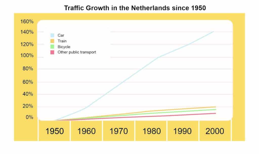
The Line Graph, is it overtime? Is it compared by years?
If yes, then what do you use? Language of change it is!
Does it have other things to be compared?
If yes, you may have some language of comparison and contrast as an additional language.
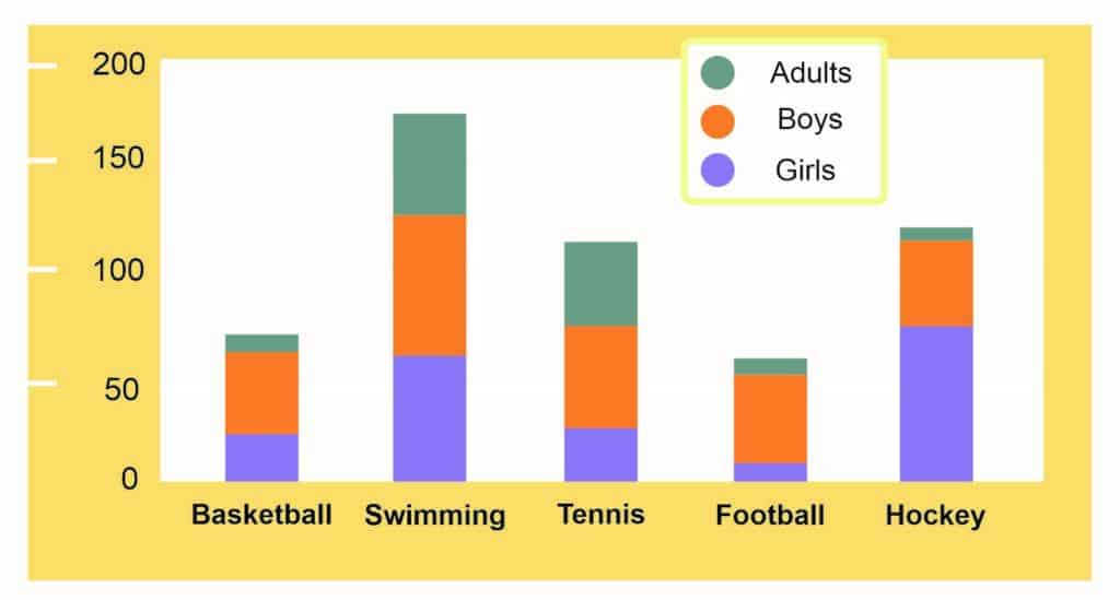
The Bar Chart now, is it overtime?
If not, then you CAN’T use the language of change.
What do you use instead?
Does it have anything to be compared?
Yes, so it’s a language of comparison and contrast.
If it is not overtime and there are things to compare within the data, as in the Bar Chart, then, language of comparison and contrast should be used.
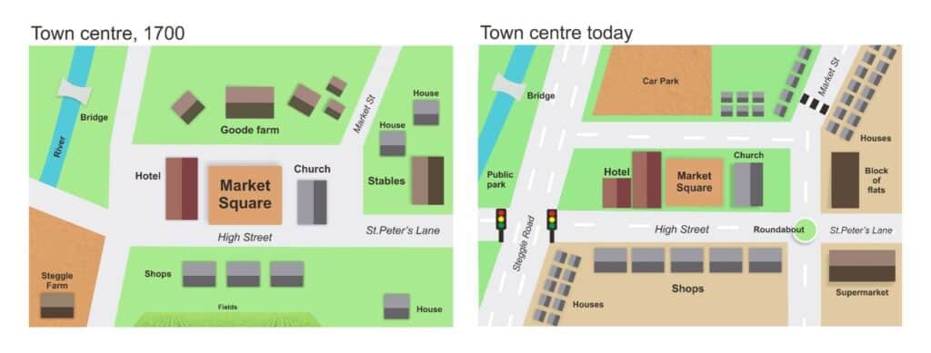
How about the Maps?
Is it over time?
If they are not over time and cannot be compared, as in the Maps, then check the additional languages for the correct language to use.
What do you think would be the most appropriate one?
Yes, use prepositional phrases!
Summary
So, as we have explained above, different graphic information requires different language use!
Don’t get it mixed up if you don’t want your score to suffer!
We understand that it might be hard to memorize those all at once, but don’t worry, we are to help! Book a free consultation with us to see how we can help you! :)
NEXT STEPS
Do you want to achieve your IELTS target?
We just shared the tips and strategies you need to ace IELTS speaking part 1. Armed with these strategies, you can take the first step on the road to achieve your dream IELTS score.
But if you want to guarantee success in your IELTS test…
And
You’re tired of wasting time and money on strategies and courses that don’t work…
And
You’re confused on which IELTS course to take….
Then check out our Indonesia’s best IELTS preparation course to achieve your target IELTS score and embark on the next chapter of your life!
IELC has the best track record in Indonesia for helping our students achieve their IELTS target and we will use our experience and expertise to make sure you will achieve your target too!
P.S. If you are curious about your IELTS score, contact us about our simulation tests complete with feedback for writing and speaking tests!
Sincerely,
Anthony McCormick
IELC Managing Director